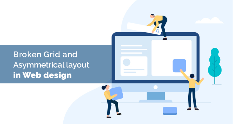
Broken Grid and Asymmetrical layout in Web design

Developing great websites and apps is increasing. Expectations of the People’s are changing. Usually when we have a great design, it does the job of driving the user to our website, but if the functionality part is weak, the people leave and user experience suffers. In some cases, the functionality part is amazing, but there are no users to experience it because the design part failed to attract them.
The Designers have implemented grids to ensure that their page layouts appear beautiful and instantly to drive user attention, with dynamic effects. But now, it is time to break and introduce something beyond the grid. It might not be easy to get rid of the grid entirely since it has already become popular over the internet. It has been playing an important role in offering a distinct and beautiful experience to the users.
Thus the asymmetrical layout can be thought about – for irregular shapes, organizing text and image overlapping. The realistic effect will bloom within your site with no compromise over the functional part.
For learning about asymmetry, it is first important to have a clear understanding of what exactly grids.
A grid is a network of lines that cross each other to form a series of squares. In design, grids are used to divide pages vertically and horizontally into columns and inter-column spaces (also called gutters).
Just by throwing elements here and there, an asymmetrical layout does not appear. It is important to carefully bring along elements within the design that will altogether establish a beautiful hierarchy. Designers can do this by using certain uncommon positioning patterns, layering with textures and colors. You can repeat, irregular patterns, use white space, and use typography to bring about some depth to the page. Without a grid layout, this cannot be achieved. So asymmetrical layouts work hand in hand with grids.
To find a balance between creativity and functionality is one of the challenges that web designers and developers are going through these days when creating websites for business, corporate purposes or even online stores. Our major aim is to ensure that our site is capable of attracting people and then offering them a great user experience that fulfills their expectations.
When the asymmetrical balance is achieved – you would have offset elements using space, weight, focused on colors, used a grid for aligning and placing elements, and importance has been given to motion and more.